The Divi Email Opt-in Module
How to add, configure and customize the Divi email optin module.
Growing your mailing list is easy using Divi’s Email Optin module. The email optin module now supports 20 of the most popular email marketing providers.

How To Add An Email Optin Module To Your Page
Before you can add a email optin module to your page, you will first need to jump into the Divi Builder. Once the Divi Theme has been installed on your website, you will notice a Use Divi Builder button above the post editor every time you are building a new page. Clicking this button will enable the Divi Builder, giving you access to all of the Divi Builder’s modules. Next, click the Use Visual Builder button to launch the builder in Visual Mode. You can also click the Enable Visual Builder button when browsing your website on the front end if you are logged in to your WordPress Dashboard.

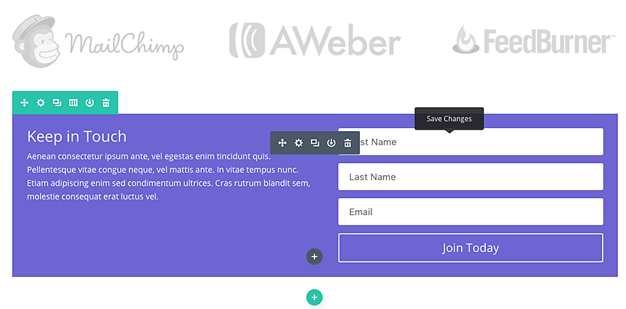
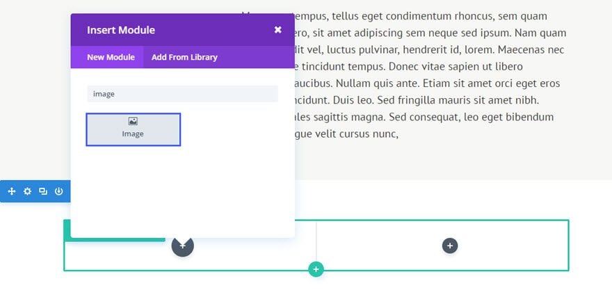
Once you have entered the Visual Builder, you can click the gray plus button to add a new module to your page. New modules can only be added inside of Rows. If you are starting a new page, don’t forget to add a row to your page first. We have some great tutorials about how to use Divi’s row and section elements.
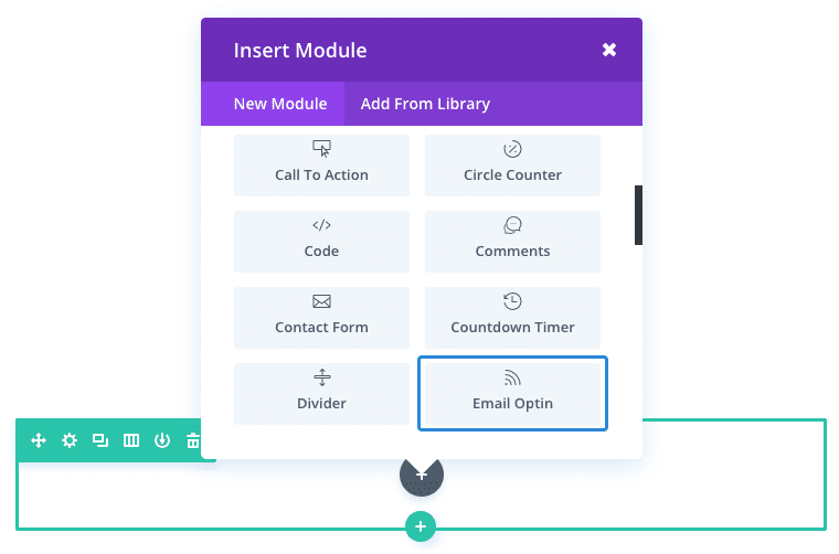
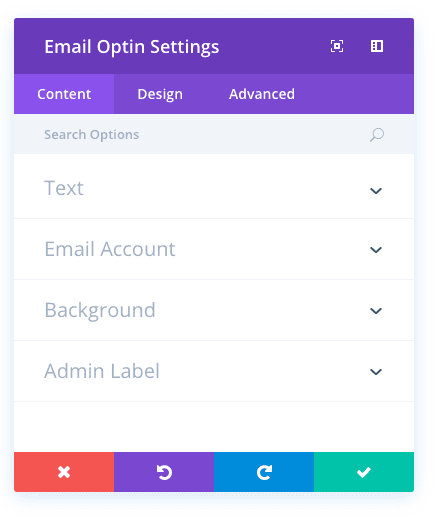
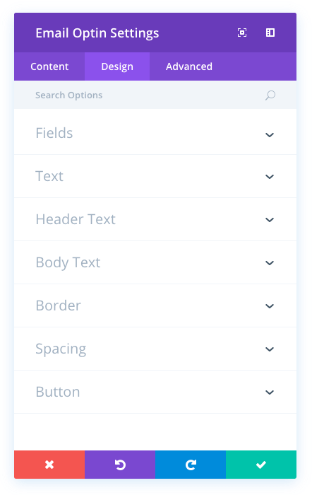
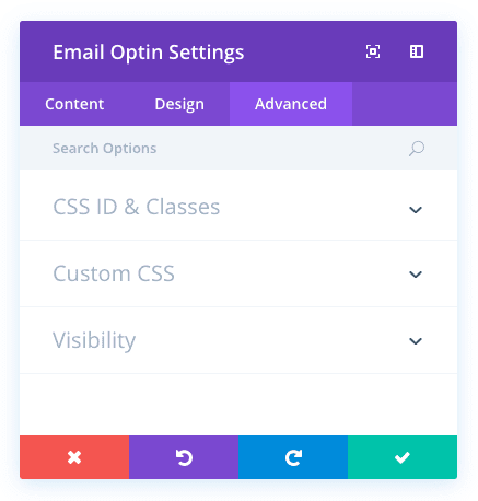
Locate the email optin module within the list of modules and click it to add it to your page. The module list is searchable, which means you can also type the word “email optin” and then click enter to automatically find and add the email optin module! Once the module has been added, you will be greeted with the module’s list of options. These options are separated into three main groups: Content, Design and Advanced.
Configuring Email Accounts
Before you can use the email optin module, you will first need to connect it to an email provider. These providers can be added and managed within the module settings. Once you add a new email provider, it will appear in the module settings whenever you edit an email optin module on your website.
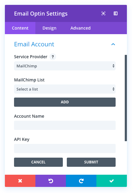
To add a new email provider, first select your email provider from the Select Provider list. Next, click the Add button to link the module to your email account.
VIEW DOCUMENTATION FOR SUPPORTED EMAIL PROVIDERS
Configuring Spam Protection Accounts
The email optin module gives you the option to utilize a 3rd-party service for spam protection. Spam protection providers can be added and managed within the module settings. Once you add a new spam protection provider, it will appear in the module settings whenever you edit an email optin or contact form module on your website.
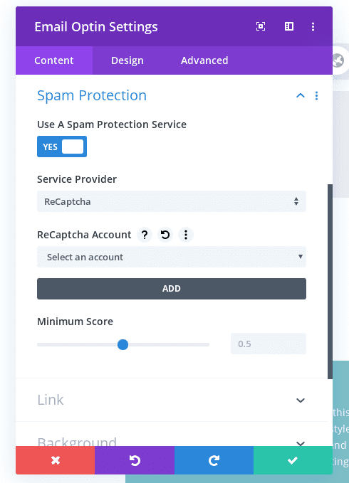
To add a new spam protection provider, first select your provider from the Select Provider list and then click the Add button. Now you should see some new fields appear for api keys, secrets, etc (it varies by provider). You can find the keys/secrets in your account on your spam provider’s website.
VIEW DOCUMENTATION FOR SUPPORTED SPAM PROTECTION PROVIDERS
Use Case Example: Adding An Email Optin to the Bottom of a Blog Post
A common place to add an email optin form is just below your post content.
For this quick example, I’m going to show you just how easy it is insert and style a Email Optin Module below a blog post using the Visual Builder.
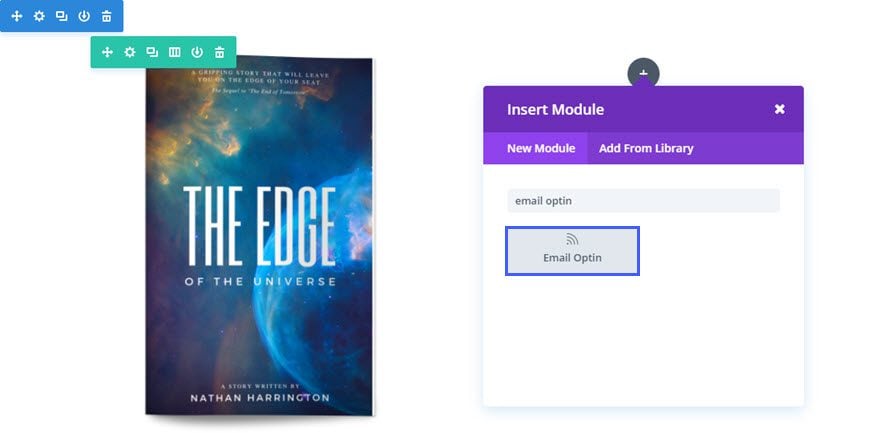
Using the Visual Builder, add Standard Section with a one-half one-half (2 column) row under the section containing the post content.
Since this example is going to be an e-book offer with the optin, add an Image Module to the left column and upload an image of the book. Set the image alignment to “Center” and set the image max width to 300px.
Then add the Email Optin Module to the right column.
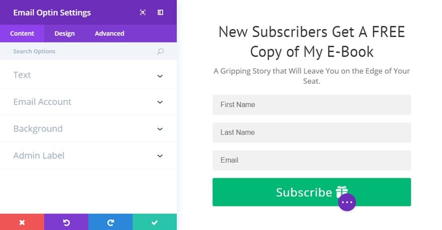
Update the Email Optin Settings as follows:
Content Options
Title: “New Subscribers Get A FREE Copy of My E-Book”
Button Text: “Subscribe”
Content: “A Gripping Story that Will Leave You on the Edge of Your Seat.”
Service Provider: [select service provider]
Select List or Feed Title
Design Options
Form Field Background Color: #f1f1f1
Focus Background color: #ffffff
Use Focus Border Color: YES
Focus Border Color: #02b875
Text Color: Dark
Text Orientation: Center
Header Font: PT Sans
Header Font Size: 35px
Head Line Height: 1.3em
Body Font Size: 18px
Custom Padding: 20px Right, 20px Left
Use Custom Styles for Button: YES
Button Text Size: 26px
Button Text Color: #ffffff
Button Background Color: #02b875
Button Border Width: 2
Button Border Color: #02b875
Button Letter Spacing: 1px
Add Button Icon: Yes
Button Icon: [add icon]
That’s it. If you want to take your email opt-ins to the next level you can get Bloom, Divi’s email opt-in and lead generation plugin specially built to help you grow your email list.
Email Optin Content Options
Within the content tab you will find all of the module’s content elements, such as text, images and icons. Anything that controls what appears in your module will always be found within this tab.
Title
Insert the title of your signup form here.
Button Text
Specify the signup button text here.
Content
This field is where you can enter the SignUp Module content.
Email Account
Service Provider
Here you can choose which mailing list provider you are using. See the section on this page titled “Configuring Email Accounts” above for more details.
Spam Protection
Service Provider
Here you can choose which spam protection provider you are using. See the section on this page titled “Configuring Spam Protection Accounts” above for more details.
Use Background Color
If enabled, a background color will be applied to the module. If a background color has been enabled, additional padding is added inside the module to separate the text content from the visible edge of the module. If a background color is not enabled, the background of the module becomes transparent and the additional padding is removed.
Background Color
You can make your Signup tile any color you wish by using the color selector. Select the same color as its section background to create the appearance of a full width or borderless effect.
Admin Label
This will change the label of the module in the builder for easy identification. When using WireFrame view in the Visual Builder, these labels will appear within the module block in the Divi Builder interface.
Email Opt-in Design Options
Within the design tab you will find all of the module’s styling options, such as fonts, colors, sizing and spacing. This is the tab you will use to change how your module looks. Every Divi module has a long list of design settings that you can use to change just about anything.
Form Field Background Color
The email optin form contains two input fields for username and password. You can use this setting to adjust the background color of these fields.
Form Field Text Color
The email optin form contains two input fields for username and password. You can use this setting to adjust the text color of these fields. If you have adjusted the form field background color you may also want to adjust the text color to ensure a harmonious color relationship.
Focus Background Color
When an input field is focused with a visitor’s mouse, the colors change to make it clear which field is active. Here you can define the background color of focused fields.
Focus Text Color
When an input field is focused with a visitor’s mouse, the colors change to make it clear which field is active. Here you can define the text color of focused fields.
Use Focus Border Color
If you would like to add a border to input fields when they are focused, you can enable this option.
Focus Border Color
Using this setting you can change the color of the border that appears on focused input fields.
Text Color
If the Background Color is dark, the Text Color should be set to ‘Light’. Visa versa, if the Background Color is light, the Text Color should be set to ‘Dark’.
Text Orientation
This dropdown menu allows you to specify the orientation of your text to be Left Justified, Centered, or Right Justified.
Header Font
You can change the font of your header text by selecting your desired font from the dropdown menu. Divi comes with dozens of great fonts powered by Google Fonts. By default, Divi uses the Open Sans font for all text on your page. You can also customize the style of your text using the bold, italic, all-caps and underline options.
Header Font Size
Here you can adjust the size of your header text. You can drag the range slider to increase or decrease the size of your text, or you can input your desired text size value directly into the input field to the right of the slider. The input fields supports different units of measurement, which means you can input “px” or “em” following your size value to change its unit type.
Header Text Color
By default, all text colors in Divi will appear as white or dark gray. If you would like to change the color of your header text, choose your desired color from the color picker using this option.
Header Letter Spacing
Letter spacing affects the space between each letter. If you would like to increase the space between each letter in your header text, use the range slider to adjust the space or input your desired spacing size into the input field to the right of the slider. The input fields supports different units of measurement, which means you can input “px” or “em” following your size value to change its unit type.
Header Line Height
Line height affects the space between each line of your header text If you would like to increase the space between each line, use the range slider to adjust the space or input your desired spacing size into the input field to the right of the slider. The input fields supports different units of measurement, which means you can input “px” or “em” following your size value to change its unit type.
Body Font
You can change the font of your body text by selecting your desired font from the dropdown menu. Divi comes with dozens of great fonts powered by Google Fonts. By default, Divi uses the Open Sans font for all text on your page. You can also customize the style of your text using the bold, italic, all-caps and underline options.
Body Font Size
Here you can adjust the size of your body text. You can drag the range slider to increase or decrease the size of your text, or you can input your desired text size value directly into the input field to the right of the slider. The input fields supports different units of measurement, which means you can input “px” or “em” following your size value to change its unit type.
Body Text Color
By default, all text colors in Divi will appear as white or dark gray. If you would like to change the color of your body text, choose your desired color from the color picker using this option.
Body Letter Spacing
Letter spacing affects the space between each letter. If you would like to increase the space between each letter in your body text, use the range slider to adjust the space or input your desired spacing size into the input field to the right of the slider. The input fields supports different units of measurement, which means you can input “px” or “em” following your size value to change its unit type.
Body Line Height
Line height affects the space between each line of your body text If you would like to increase the space between each line, use the range slider to adjust the space or input your desired spacing size into the input field to the right of the slider. The input fields supports different units of measurement, which means you can input “px” or “em” following your size value to change its unit type.
Use Border
Enabling this option will place a border around your module. This border can be customized using the following conditional settings.
Border Color
This option affects the color of your border. Select a custom color from the color picker to apply it to your border.
Border Width
By default, borders have a width of 1 pixel. You can increase this value by dragging the range slider or by inputting a custom value into the input field to the right of the slider. Custom units of measurements of supported, which means you can change the default unit from “px” to something else, such as em, vh, vw etc.
Border Style
Borders support eight different styles, including: solid, dotted, dashed, double, groove, ridge, inset and outset. Select your desired style from the dropdown menu to apply it to your border.
Custom Margin
Margin is the space added outside of your module, between the module and the next element above, below or to the left and right of it. You can add custom margin values to any of the module’s four sides. To remove custom margin, delete the added value from the input field. By default these values are measured in pixels, but you can input custom units of measurement into the input fields.
Custom Padding
Padding is the space added inside of your module, between the edge of the module and its internal elements. You can add custom padding values to any of the module’s four sides. To remove custom margin, delete the added value from the input field. By default these values are measured in pixels, but you can input custom units of measurement into the input fields.
Use Custom Styles for Button
Enabling this option will reveal various button customization settings that you can use to change the appearance of your module’s button.
Button Text Size
This setting can be used to increase or decrease the size of the text within the button. The button will scale as the text size is increased and decreased.
Button Text Color
By default, buttons assume your theme accent color as defined in the Theme Customizer. This option allows you to assign a custom text color to the button in this module. Select your custom color using the color picker to change the button’s color.
Button Background Color
By default, buttons have a transparent background color. This can be changed by selected your desired background color from the color picker.
Button Border Width
All Divi buttons have a 2px border by default. This border can be increased or decreased in size using this setting. Borders can be removed by inputting a value of 0.
Button Border Color
By default, button borders assume your theme accent color as defined in the Theme Customizer. This option allows you to assign a custom border color to the button in this module. Select your custom color using the color picker to change the button’s border color.
Button Border Radius
Border radius affects how rounded the corners of your buttons are. By default, buttons in Divi has a small border radius that rounds the corners by 3 pixels. You can decrease this to 0 to create a square button or increase it significantly to create buttons with circular edges.
Button Letter Spacing
Letter spacing affects the space between each letter. If you would like to increase the space between each letter in your button text, use the range slider to adjust the space or input your desired spacing size into the input field to the right of the slider. The input fields supports different units of measurement, which means you can input “px” or “em” following your size value to change its unit type.
Button Font
You can change the font of your button text by selecting your desired font from the dropdown menu. Divi comes with dozens of great fonts powered by Google Fonts. By default, Divi uses the Open Sans font for all text on your page. You can also customize the style of your text using the bold, italic, all-caps and underline options.
Add Button Icon
Disabled this setting will remove icons from your button. By default, all Divi buttons display an arrow icon on hover.
Button Icon
If icons are enabled, you can use this setting to pick which icon to use in your button. Divi has various icons to choose from.
Button Icon Color
Adjusting this setting will change the color of the icon that appears in your button. By default, the icon color is the same as your buttons’ text color, but this setting allows you to adjust the color independently.
Button Icon Placement
You can choose to have your button icon display on the left or the right side of your button.
Only Show Icon On Hover for Button
By default, button icons are only displayed on hover. If you would like the icon to always appear, disable this setting.
Button Hover Text Color
When the button is hovered over by a visitor’s mouse, this color will be used. The color will transition from the base color defined in the previous settings.
Button Hover Background Color
When the button is hovered over by a visitor’s mouse, this color will be used. The color will transition from the base color defined in the previous settings.
Button Hover Border Color
When the button is hovered over by a visitor’s mouse, this color will be used. The color will transition from the base color defined in the previous settings.
Button Hover Border Radius
When the button is hovered over by a visitor’s mouse, this value will be used. The value will transition from the base value defined in the previous settings.
Button Hover Letter Spacing
When the button is hovered over by a visitor’s mouse, this value will be used. The value will transition from the base value defined in the previous settings.
Email Optin Advanced Options
Within the advanced tab, you will find options that more experienced web designers might find useful, such as custom CSS and HTML attributes. Here you can apply custom CSS to any of the module’s many elements. You can also apply custom CSS classes and IDs to the module, which can be used to customize the module within your child theme’s style.css file.
CSS ID
Enter an optional CSS ID to be used for this module. An ID can be used to create custom CSS styling, or to create links to particular sections of your page.
CSS Class
Enter optional CSS classes to be used for this module. A CSS class can be used to create custom CSS styling. You can add multiple classes, separated with a space. These classes can be used in your Divi Child Theme or within the Custom CSS that you add to your page or your website using the Divi Theme Options or Divi Builder Page Settings.
Custom CSS
Custom CSS can also be applied to the module and any of the module’s internal elements. Within the Custom CSS section, you will find a text field where you can add custom CSS directly to each element. CSS input into these settings are already wrapped within style tags, so you need only enter CSS rules separated by semicolons.
Visibility
This option lets you control which devices your module appears on. You can choose to disable your module on tablets, smart phones or desktop computers individually. This is useful if you want to use different modules on different devices, or if you want to simplify the mobile design by eliminating certain elements from the page.
